since i've been spending lots of time in photoshop, i thought i would share some of my assignments with you. this last assignment involved creating a visitors guide cover for my hometown. i created one for alaska, since most of my pictures weren't specific to anchorage.
after choosing a number of photos, i had to edit them - adjust brightness, sharpen certain areas, smooth other areas, etc - then apply appropriate artistic filters that would showcase the images without going over the top.
bear pic - i wanted it to have a painting type look to it, but still keeping the detail.
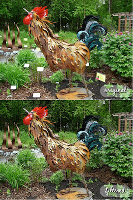
rooster pic - i accentuated the edges and made the colors a tad more vibrant, in addition to removing the little signs.

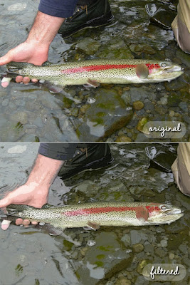
trout pic - i used the cutout filter - which i really love - but toned it down to still show off the color & spots on the trout.

click on the link below the picture (or open in a new tab), then click to zoom in to see a larger version - i couldn't get blogger to upload a larger pic.
what do you think?


No comments:
Post a Comment